Short answer: for a novel, choose a classic book serif:
- EB Garamond, Crimson Pro, Alegreya or a Palatino-style font are the safe choices.
- Georgia, or its free twin Gelasio, suits readers who like a larger look.
- For non-fiction, Source Serif, Literata or Lora.
The font also changes your printing bill. We set the whole of Pride and Prejudice in 18 fonts at the same size: it took 282 pages in EB Garamond and 374 in Libre Baskerville. On a KDP paperback that’s 92 extra pages, or 92p more printing cost on every copy.
The test: one novel, 18 fonts, same size
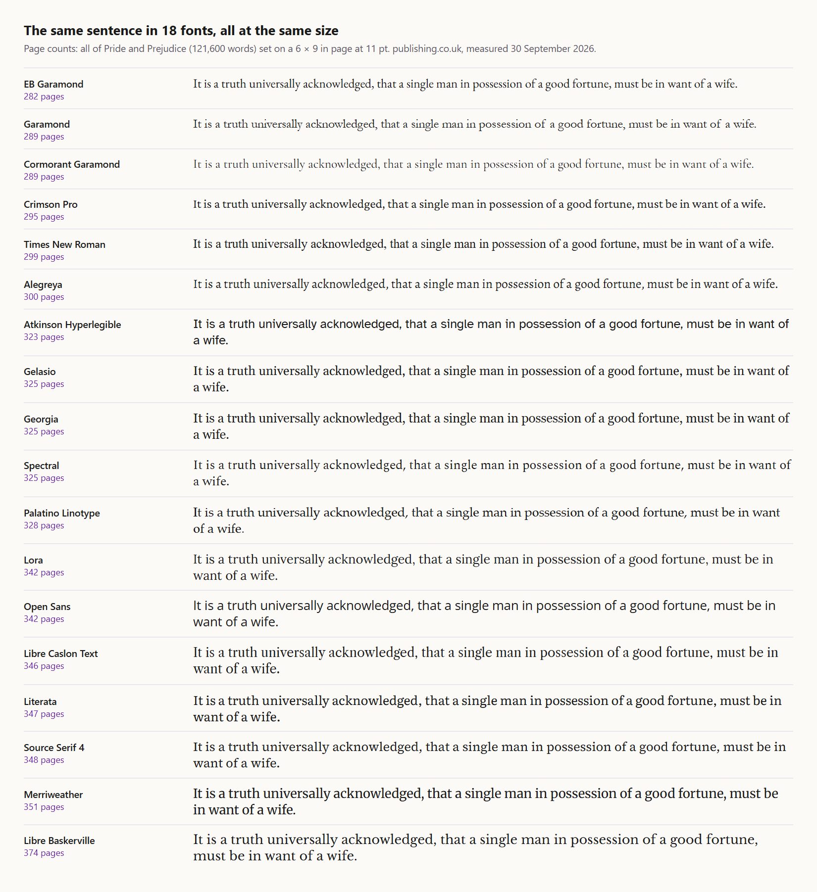
We took the full text of Pride and Prejudice (121,600 words) and set it the way a typical paperback is set:
- 11 pt type, 1.35 line spacing, justified and hyphenated.
- A 6 × 9 in page with normal margins.
We changed nothing but the font. Real books also have chapter openings, which add pages, so treat the numbers as a comparison between fonts rather than a page count for your book.
| Font | Pages (whole novel) | Pages for 80,000 words | Extra pages vs EB Garamond | Extra print cost per copy | Licence |
|---|---|---|---|---|---|
| EB Garamond | 282 | 186 | 0 | £0.00 | Free (OFL) |
| Garamond (Windows) | 289 | 191 | +7 | £0.07 | With Windows/Office |
| Cormorant Garamond | 289 | 191 | +7 | £0.07 | Free (OFL) |
| Crimson Pro | 295 | 194 | +13 | £0.13 | Free (OFL) |
| Times New Roman | 299 | 197 | +17 | £0.17 | With Windows/Office |
| Alegreya | 300 | 197 | +18 | £0.18 | Free (OFL) |
| Atkinson Hyperlegible | 323 | 213 | +41 | £0.41 | Free (OFL) |
| Gelasio | 325 | 214 | +43 | £0.43 | Free (OFL) |
| Georgia | 325 | 214 | +43 | £0.43 | With Windows/Office |
| Spectral | 325 | 214 | +43 | £0.43 | Free (OFL) |
| Palatino Linotype | 328 | 216 | +46 | £0.46 | With Windows/Office |
| Lora | 342 | 225 | +60 | £0.60 | Free (OFL) |
| Open Sans | 342 | 225 | +60 | £0.60 | Free (OFL) |
| Libre Caslon Text | 346 | 228 | +64 | £0.64 | Free (OFL) |
| Literata | 347 | 228 | +65 | £0.65 | Free (OFL) |
| Source Serif 4 | 348 | 229 | +66 | £0.66 | Free (OFL) |
| Merriweather | 351 | 231 | +69 | £0.69 | Free (OFL) |
| Libre Baskerville | 374 | 246 | +92 | £0.92 | Free (OFL) |
Extra print cost uses KDP’s UK charge of £0.010 a page for black-and-white paperbacks over 110 pages. A check on the method: Gelasio is drawn to Georgia’s letter widths, and the two set the whole novel within one line of each other (11,363 and 11,364 lines).
Why the same size doesn’t mean the same size
The table is fair in one way and unfair in another. Every font is at 11 pt, but point size measures the metal body a letter once sat on, not the letters. The Garamonds have small lowercase letters and narrow shapes, so at 11 pt they look smaller and fit more on a line. Merriweather and Baskerville have big, wide lowercase letters, so at 11 pt they look larger.
So a designer rarely sets them at the same size. Garamond usually goes up to 11.5 or 12 pt; Merriweather can come down to 10 or 10.5 pt. Even then the wide fonts use more paper. The practical lesson: choose the font by how it reads at the size you’ll use, then check the page count, because on a long book the difference is real money.
The best fonts for books, by kind of book
Novels
- EB Garamond: the classic literary-fiction look, and the most economical in our test. Set it at 11.5 to 12 pt.
- Crimson Pro: a Garamond-style font with a slightly sturdier text, good for ebooks and print alike.
- Alegreya: designed for long reading, with a calligraphic feel that suits fantasy and historical fiction.
- A Palatino-style font (Palatino Linotype, or the free TeX Gyre Pagella): open and even, a common choice for thrillers and commercial fiction.
Non-fiction, memoir and business
- Source Serif 4 and Literata: built for reading on screens and paper, clear at small sizes, good with headings and tables.
- Lora: friendly and slightly bold in feel, a good match for self-help and memoir.
- Georgia or Gelasio: large and very readable. Good for older readers, but it uses about 15% more pages than Garamond.
Children’s, large print and accessibility
- Atkinson Hyperlegible was designed by the Braille Institute for low-vision readers, and it’s the one sans-serif we’d put in a chapter book or large-print edition.
- Keep Open Sans and other sans-serifs for headings, captions and workbooks; long runs of sans text tire readers faster in print.
Fonts to avoid for the body text
- Times New Roman: it fits a lot on the page, but it was designed for narrow newspaper columns and makes a book look like a Word document.
- Display fonts (Cinzel, Playfair and other decorative faces): fine for a chapter title, tiring for 300 pages.
- Anything without a real italic and bold. A font that fakes italics by slanting the letters looks wrong in print, and KDP prints exactly what you send.
Licences: can you use these fonts in a book you sell?
Every Google font in our test is published under the SIL Open Font Licence; we checked the licence file for each one. The licence’s own site says you “can use them in books, posters, artwork, logos, and on websites… no acknowledgement is required”. What you can’t do is sell the font files themselves.
Fonts that come with Windows or Office (Times New Roman, Georgia, Palatino Linotype, Garamond) are licensed with that software, so read the licence before you embed one in a book for sale. The easy way round it is a free equivalent drawn to the same widths. Gelasio matches Georgia, and set our novel on exactly the same number of pages. TeX Gyre Pagella matches Palatino.
Whatever you choose, KDP requires every font to be embedded in a paperback PDF. A missing font is a common rejection; see KDP font not embedded for the fix.
Choose the font by looking at your own book
Book Studio sets your manuscript in 19 fonts (Garamond, Baskerville, Caslon, Palatino, Georgia styles and more, each with a real bold and italic) or your own, and shows you every page before you pay. £29.99 per book.
Try Book StudioChoosing in five minutes
- Pick three candidates from the lists above for your kind of book.
- Print one page of each at 11 pt and 12 pt on ordinary paper and read them at arm’s length. Screen previews flatter every font.
- Check the page count at your trim size. Our word count to page count tool gives a baseline, and the table above shows how far each font moves it.
- Check the cost with the KDP royalty calculator. On a long novel the font can decide whether £9.99 earns you a royalty; see how many words in a novel.
- Check it has real italic and bold and embeds in your PDF.
Frequently asked questions
What is the best font for a book?
For a novel, EB Garamond, Crimson Pro, Alegreya or a Palatino-style font. For non-fiction, Source Serif, Literata or Lora. Georgia, or its free twin Gelasio, looks larger and suits readers who find small type hard.
What font size should a book be?
Most printed novels are set at 10.5 to 12 pt, usually 11 to 12 for a paperback. Small-lettered fonts like Garamond need the larger end; wide fonts like Merriweather can sit lower. Large-print editions typically use 16 pt and up.
Does the font change how many pages my book has?
Yes. At the same size, the same novel took 282 pages in EB Garamond and 374 in Libre Baskerville. On KDP that’s about 92p more printing cost on every paperback.
Can I use Google Fonts in a book I sell?
Yes. They’re under the SIL Open Font Licence, which allows use “in books” with “no acknowledgement” required. You can’t sell the font files themselves.
Can I use Times New Roman or Georgia in a published book?
They’re licensed with Windows or Office, so check that licence first. Or use a free equivalent: Gelasio matches Georgia, TeX Gyre Pagella matches Palatino.
What font does Amazon KDP require?
None in particular. KDP requires every font to be embedded in a paperback PDF; Kindle readers can change the font on their device.
Sources
- Our measurement: Project Gutenberg #1342, Pride and Prejudice, set in Chrome with each font, 30 September 2026. Method in the note at the top.
- SIL Open Font Licence: https://openfontlicense.org/
- Licence files: https://github.com/google/fonts/tree/main/ofl (each family’s OFL.txt, checked 30 September 2026)
- Amazon KDP, paperback printing cost: https://kdp.amazon.com/en_US/help/topic/G201834340
Who wrote this. I am Robert Prime. I run publishing.co.uk, and our Book Studio sets books in many of the fonts above, so font choice is something we test on real manuscripts every week. The page counts here are our own measurement, and the method is stated so you can repeat it.